Overview
We’ve just released a new version of Microsoft.FluentUI.AspNetCore.Components 4.1. This version fixes some bugs detected over the last few days, but also adds a few new features.
- FluentCalendar: Days / Months / Years views added.
- FluentCheckbox: Indeterminate status added.
- FluentAccordionItem: added
HeaderTemplateattribute. - FluentSplitter: added
OnCollapsedandOnExpandedfunctionality.
New features
FluentCalendar
We’ve added a View attribute that lets you choose the display of this component: Days, Months or Years.
As proposed by FluentUI, by default, the monthly view animates the values when the month is changed.
You can disable this feature (or enable it for other views), via the AnimatePeriodChanges property.
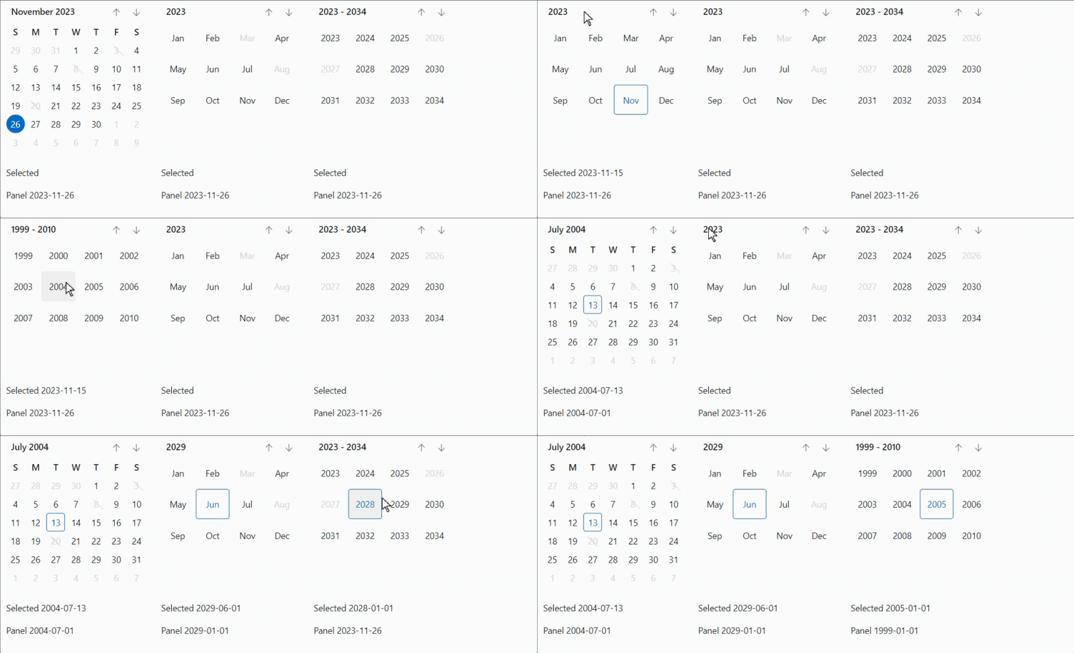
We’ve also updated the FluentDatePicker component to take advantage of these new views when selecting a date.
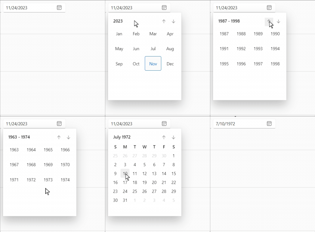
note: at present, these components are not fully compatible with Accessibility standards (this will be resolved in a future version).
FluentCheckbox
We’ve added these new properties:
- ThreeState: This value indicates whether the checkbox allows three check states instead of two (by adding an “intermediate” state).
- ShowIndeterminate: This value indicates whether the user can display the indeterminate state by clicking on the checkbox. If this is not the case, the checkbox can be started in the indeterminate state, but the user cannot activate it (using the mouse, for example). Default value is true.
- CheckState: This value indicates the state of the checkbox:
true,falseornull(for undetermined).
The
ValueandCheckStateproperties are bindable.
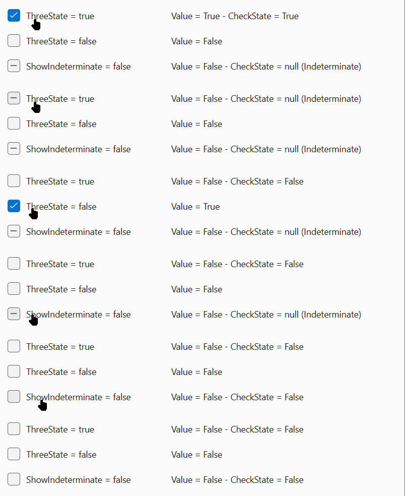
In the first example, ThreeState = true and the user can choose between Unchecked / Checked / Indeterminate.
In the second example, ThreeState = false and the user can only choose between Unchecked / Checked.
In the third example, ThreeState = true and ShowIndeterminate = true, so the first state can be Indeterminate (or updated by code), but the user can only switch between Unchecked and Checked.
FluentAccordionItem
We’ve added a HeaderTemplate attribute to customize the content of the Header.
FluentSplitter
Added Panel1MinSize, Panel2MinSize and BarSize properties to manage minimum and maximum panel sizes,
and to customize the size of the resize bar.
We’ve also made it possible to resize panels proportionally, using sizing percentages.
And finally, we’ve added the ability to collapse or expand the second panel, using
OnCollapsed, OnExpanded attributes and the OnResized event.
Corrections
- Fixed checkbox, switch and slider in EditForms not being activated on first clicks.
- Fixed Web App Template to correctly manage NavMenu according to
rendermodeand interactivity choices. - Moved CacheStorageAccessor and StaticAssetService to the
Demo.Sharedproject, as they are specific to the demo site and not to the library. - Updated Fluent UI System Icons to add the latest FluentUI icons.
- Updated the demo site by moving error handling to the demo panels only. This allows the site to continue working, even if an error is present in a demo.
Web sites
- Documentation: https://www.fluentui-blazor.net
- NuGet packages: https://aka.ms/fluent-blazor-libs
Feedback
If you find something out of the ordinary, let us know in the repo on GitHub, or Twitter / X.