Fluent UI Blazor v5.0.1 Is Now Available!
Released on October 14, 2026, Fluent UI Blazor v5.0.1 is available on NuGet. This first maintenance release after v5 adds more ways to work with read-only controls, introduces recursive selection in FluentTreeView, and makes drag-and-drop work with touch input. It also brings responsive item ordering to FluentGrid and includes focused improvements and fixes across the component library.
This is a non-breaking update. You can move to v5.0.1 without changing your existing v5 component code.
More controls can be read-only
Some values need to stay visible without allowing the user to change them. In v5.0.1, more input and selection components now honor their ReadOnly parameter, so their values remain available while interaction is prevented. Use Disabled instead when a control should be unavailable.
For example, a switch can display its current value without allowing it to be toggled:
<FluentSwitch Label="Notifications enabled"
              Value="true"
              ReadOnly="true" />

See the Switch examples and Listbox documentation for component-specific usage. #5369
Recursive selection in TreeView
FluentTreeView can now manage recursive multi-selection. Selecting a parent selects its descendants, and clearing it clears the descendants. Parent checkboxes reflect their children: they are checked when all children are selected and indeterminate when only part of the branch is selected.
<FluentTreeView Items="@Items"
                SelectionMode="TreeSelectionMode.MultipleRecursive"
                HideSelection="true"
                @bind-SelectedItems="@SelectedItems" />

@code {
    private IEnumerable<ITreeViewItem>? SelectedItems = [];

    private readonly TreeViewItem[] Items =
    [
        new("engineering", "Engineering",
        [
            new TreeViewItem("platform", "Platform"),
            new TreeViewItem("applications", "Applications")
        ])
    ];
}
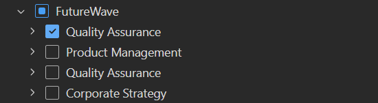
For custom checkbox states, use CheckState with TreeSelectionMode.Multiple and update SelectedItems in SelectedItemsChanged. CheckState is ignored in MultipleRecursive, where the component calculates the states automatically. Recursive selection requires the full descendant data to be available. See the TreeView documentation for both approaches. #5419
Drag-and-drop on touch devices
FluentDragContainer and FluentDropZone now support native touch gestures. Existing drag-and-drop markup can therefore support touch users without a separate touch-specific implementation. See the Drag and Drop examples. #5418
Responsive item ordering in Grid
FluentGridItem now accepts OrderXs, OrderSm, OrderMd, OrderLg, OrderXl, and OrderXxl. These parameters let you change the visual order of items at each breakpoint while keeping the markup concise:
<FluentGrid Spacing="2">
    <FluentGridItem Xs="12" Md="4">
        First in the DOM
    </FluentGridItem>
    <FluentGridItem Xs="12" Md="4" OrderXs="5" OrderMd="1">
        Second in the DOM
    </FluentGridItem>
    <FluentGridItem Xs="12" Md="4" OrderXs="1" OrderMd="5">
        Third in the DOM
    </FluentGridItem>
</FluentGrid>
Order values are mobile-first: a value remains in effect at wider breakpoints until another order parameter overrides it. The supported values are -1 for first, 0 to 5, and 6 for last. Ordering changes only the visual presentation, not DOM order, so keep the source order meaningful for keyboard and screen-reader users.
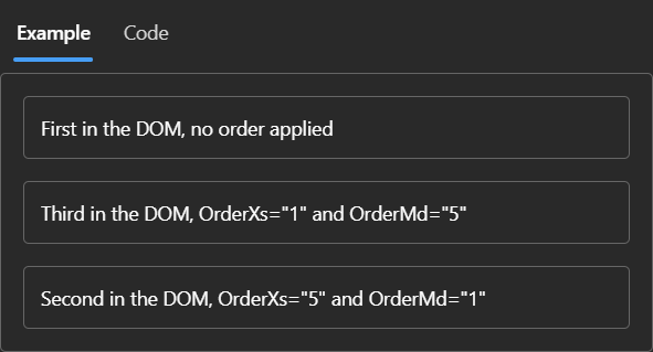
See the Grid documentation for the full responsive example. #5437
Forms, templates, and component discovery
Required-field messages now use a shared approach across standard and composite input components. A message from a model’s RequiredAttribute is respected, and a generated required message is not shown when the EditContext already supplies a validation message. The changes cover components such as Autocomplete and DatePicker as well as individual inputs. #5399, #5400
The required-field indicator styling was also corrected, including fields with input adornments. See the Field documentation. #5416
The demo site now has a Sticker Sheet that puts many of the components on one page for a quick overview. #4995
The project templates have also been updated: .NET 11 RC1 templates are available, the Aspire starter targets Aspire 13.6, and the generated headers, footers, and styles have been simplified. Browse the project templates to choose a starting point. #5366, #5375, #5387
Other improvements
FluentTimePickernow validatesStartHour,EndHour, andIncrement, with the supported values clarified in the TimePicker documentation. #5346FluentSelectnow respects an explicitly suppliedaria-labelwhen determining its accessible name. See the Select documentation. #5356FluentDataGridavoids unnecessary work when retrieving the total item count. #5389- JavaScript interop errors now propagate more reliably, and Checkbox avoids unnecessary observer setup on its first render. #5415
- Markup sanitization now uses predictable, non-backtracking regular expressions to avoid regex timeouts when processing markup. #5429
OverflowChangedItemretains the public constructor metadata needed by trimmed applications. See Overflow. #5430- The DataGrid table now exposes
role="grid"for assistive technologies. See the DataGrid documentation. #5434
Bug Fixes
- Popovers now reposition when their content changes size. #5354
- Nested tab groups keep their own horizontal or vertical orientation. #5353
- Overlay styles supplied through
OverlayOptionsare applied correctly. #5362 - Pinned DataGrid columns no longer receive unwanted insets when master/detail rows and resizable columns are used together. #5363
- The navigation drawer now closes after a link is selected in SSR mode. #5390
- DatePicker year navigation now reaches valid years at the
MinDateandMaxDateboundaries. #5392 - PresenceBadge icons update when the
StatusorOutOfOfficeparameter changes. #5414 - Autocomplete clears its input after an option is selected with Enter. #5425
- Menu icons no longer overlap labels in Firefox. #5433
- Theme mode JSON serialization is corrected for .NET 9 and later. #5435
- DatePicker parses year values using the selected culture. #5445
Resources
| Resource | Link |
|---|---|
| NuGet | Microsoft.FluentUI.AspNetCore.Components |
| Documentation and demo | https://fluentui-blazor.net |
| GitHub | https://github.com/microsoft/fluentui-blazor |
Thank you to everyone who contributed code, tested the components, reported issues, and improved the documentation. We hope these updates make your Fluent UI Blazor applications easier to build and use.