Fluent UI Blazor v5.1.0 Is Now Available!
We are pleased to announce Fluent UI Blazor v5.1.0, released on November 16, 2026!
This release adds new ways to build the everyday interactions in your Blazor applications: a profile menu for account information, splash screens that follow the progress of your loading tasks, drag-and-drop between independent containers, and a viewport breakpoint that your components can consume directly.
It also makes splitter handles and keyboard focus easier to see, improves several input and accessibility scenarios, and updates the project templates for the stable .NET 11 release.
Read the release notes on GitHub. Documentation and examples are available on the Fluent UI Blazor demo website.
A Profile Menu for Your Application Header
An avatar in the application header is a familiar place to find account details and user-specific actions. Version 5.1.0 brings this experience to v5 with two complementary components:
FluentProfileMenudisplays the avatar, an optional presence badge, and the popover opened by the avatar button.FluentProfilePopoverprovides a ready-to-use layout for the user’s identity, a header, and footer actions.
Use them together for a standard account menu, or supply your own content when the application needs a different layout.
<FluentProfileMenu ImageInitials="BG"
                   Status="PresenceStatus.Available">
   <FluentProfilePopover HeaderLabel="Microsoft"
                         HeaderLinkLabel="Sign out"
                         ImageUrl="..."
                         FullName="Bill Gates"
                         Width="330px"
                         FooterLinkLabel="View account" />
</FluentProfileMenu>
For the built-in header and footer links, set their labels and handle OnHeaderLinkClick or OnFooterLinkClick. These are UI callbacks: your application remains responsible for actions such as signing out.

If you are migrating from v4, the profile menu is now composed of two components rather than one: move the identity details and their templates into the nested popover.
More details: #5444.
Splash Screens That Follow Your Loading Tasks
When opening a workspace or loading application data takes a few seconds, a splash screen can tell users what is happening instead of leaving them looking at an unchanged page.
The new DialogService.ShowSplashScreenAsync API returns an ISplashScreenInstance as soon as the dialog is displayed. Your code can then update its message and progress with UpdateAsync, and close it with CloseAsync when the work finishes.
var splash = await DialogService.ShowSplashScreenAsync(content =>
{
    content.Title = "Microsoft Fluent UI Blazor";
    content.LoadingText = "Loading...";
});

await splash.CloseAsync();
For more complete parameter management.
var splash = await DialogService.ShowSplashScreenAsync(content =>
{
    content.LogoUrl = "/images/splash-corporation-logo.png";
    content.LogoMaxWidth = "400px";
    content.Title = "Microsoft Fluent UI Blazor";
    content.SubTitle = "Powered by you";
    content.LoadingText = "Loading...";
    content.LoadingPercentage = 0; // 👈 Activate the progress bar
});

for (int i = 0; i <= 100; i += 10)
{
    await Task.Delay(500);
    await splash.UpdateAsync(content =>
    {
        content.LoadingPercentage = i;
        content.LoadingText = $"Loading... {i}%";
    });
}

await Task.Delay(500);
await splash.CloseAsync();
The delays simulate loading steps; replace them with your application’s asynchronous work.
As with other service-rendered dialogs, keep a dialog provider in your interactive layout, either directly or through FluentProviders.

You can add a logo, title, subtitle, and message, or supply a custom dialog component. Splash screens prevent dismissal with Escape by default and do not close on an automatic timer: the calling code decides when loading is complete.
More details: #5461.
Drag-and-Drop Between Independent Containers
Moving a task from one list to another should not require both lists to be nested inside a single drag container.
You can now connect independent FluentDragContainer instances by assigning the same FluentDragGroup<TItem> to their Group parameter. This is useful for boards, assignment lists, and other interfaces where an item moves between separate areas.
The group coordinates the drag operation.
All containers in a group must use the same item type, and drop-zone IDs must be unique across the group. The destination container raises the drop event. Without a group, containers remain independent, as before.
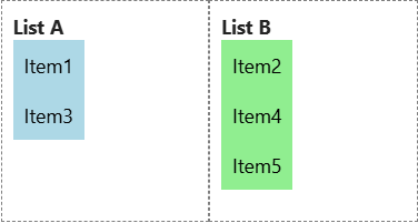
See the Drag and Drop documentation for an example that also supports inserting an item at a particular position. #5442
React to Viewport Breakpoints in Your Components
CSS remains the best choice for purely visual responsive layout. Sometimes, however, your Blazor code needs to know which breakpoint is active, for example to render a different navigation component on a small screen.
Version 5.1.0 adds an opt-in cascading viewport breakpoint. Enable it when registering Fluent UI services:
builder.Services.AddFluentUIComponents(options =>
{
    options.UseCascadingViewportBreakpoint = true;
});
Keep <FluentProviders /> in an interactive layout. It includes the breakpoint provider automatically when this option is enabled. Components can then receive the current value without subscribing to resize events:
[CascadingParameter(Name = FluentBreakpointProvider.CascadingParameterName)]
private GridItemSize? ViewportBreakpoint { get; set; }
Blazor updates the cascading parameter when the viewport crosses a breakpoint. Its value is initially null, including during prerendering, and becomes Xs, Sm, Md, Lg, Xl, or Xxl after the browser is measured.
This represents the browser viewport, not the width of an individual grid or card. Browser notifications require an interactive render mode. For server-side Blazor, retain the default scoped service lifetime so that each circuit has its own viewport state.
See the Grid documentation. #5579
FluentMultiSplitter: @bind-Size and more visible handles
Resizable panels are easier to discover when their handles remain visible. The FluentMultiSplitter resize handles and collapse/expand indicators now retain their full opacity instead of becoming faded along with the splitter bar’s background.
The result is a clearer distinction between the background separator and the controls that users can interact with. Existing splitters benefit without requiring new parameters.
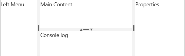
See the Splitter examples. #5570
Two-way splitter size binding.
Use @bind-Size on FluentMultiSplitterPane to receive the new percentage when resizing ends. Updating the bound size also changes the pane after a user has resized it, making actions such as “Reset layout” straightforward. Cancelled resizes do not raise SizeChanged.
See the Splitter documentation and #5467
Visible Keyboard Focus on Action Links
Links handled through OnClick, rather than an Href, now show the expected double underline when they receive keyboard focus. This also applies to quick-action links inside toasts.
Keyboard users can therefore see which action is ready to activate. The indicator appears for keyboard focus rather than adding a permanent underline or changing ordinary mouse interaction.

See the Link documentation. #5611
Improvements
Alongside these features and visual changes, v5.1.0 includes the following improvements. Each PR link provides the implementation details and discussion.
-
More control over disabled split buttons.
FluentSplitButtonnow supportsDisabledandDisabledFocusablefor the whole control.PrimaryActionDisabledandMenuButtonDisabledlet you override either half independently, so the primary action can be unavailable while alternative menu actions remain usable. UseDisabledFocusablewhen users should still be able to reach the unavailable control and hear its state. See the SplitButton documentation. #5456 -
Stable .NET 11 dependencies and templates. Package references and .NET 11 template dependencies move from release-candidate versions to the stable release. This lets you start a .NET 11 application without retaining the template’s prerelease framework references. The update also refreshes the underlying Fluent UI Web Components dependency to 3.2.1. See the project templates. #5624
-
Consistent autofocus. Supported input components can receive focus on their first render through
Autofocus, reducing the need for manual focus calls. If your C# code references the earlierAutoFocusproperty onFluentButtonorFluentCompoundButton, update it toAutofocus. #5515 -
More precise global keyboard handling.
FluentKeyCodeProviderexposesOnly,Ignore, andPreventDefaultOnly. You can listen for selected keys or suppress only particular browser defaults, rather than inadvertently blocking unrelated behavior such as Escape closing a dialog. #5477 -
Better combobox freeform binding. With
FreeOption, a selected freeform entry now updates the bound value through the input’s normal conversion and validation, including when options are declared manually. Use a string value type for arbitrary text. FluentUI-mode TimePicker still matches typed text against displayed options; use native mode for arbitrary time entry. #5598 -
Page-change announcements. The paginator announces the new page to screen readers while avoiding duplicate announcements when several paginators share the same state. Navigation buttons remain focusable at the first and last pages so that reaching a boundary does not unexpectedly move focus away. #5475
-
More informative wizard steps. Assistive technology can identify the current step and distinguish disabled steps, without changing the wizard’s appearance. #5479
-
Accessible hierarchical grid state. Hierarchy toggle buttons expose whether their child rows are expanded or collapsed, making hierarchical DataGrids easier to understand with a screen reader. #5483
-
Reordering announcements in SortableList. Screen readers receive feedback when an item is grabbed, moved, and dropped, including its position in the list. Transfers between lists also announce the new position. #5481
-
Initial theme setup guidance. The theme documentation includes a copyable example for applying the initial theme through the theme service after the first render. This documents the existing API rather than introducing a new theme mechanism. #5522
-
AI-assisted installation. A reusable GitHub Copilot prompt helps configure Fluent UI Blazor in an application, with instructions for VS Code and Visual Studio. It provides a guided starting point for setup; review and test the resulting changes as you would any application configuration. #5575
Breaking changes
When upgrading from 5.0.1 to 5.1.0, these API and a nullability-related contract change require particular attention. Other fixes change certain behaviors: they only require adjustments if your application relied on the previous behavior.
Rename AutoFocus to Autofocus in C# code
On FluentButton and FluentCompoundButton, the AutoFocus property is replaced by Autofocus, with no compatibility alias. The inherited properties on FluentMenuButton and FluentToggleButton are also affected.
Handle a missing theme color
ThemeSettings.Color changes from string to string?. In addition, when no color is available, reading the theme settings now returns an object whose Color is null, rather than a null result.
Custom localization.
Components now call Localizer[key, arguments] directly: your indexer must use the arguments to format translations, instead of returning the raw template containing {0} or {1}. Default formatting uses CultureInfo.CurrentCulture; update culture-dependent assertions accordingly. This affects date and time messages, file upload progress, autocomplete, pagination, and ToTimeAgo, among others. #5594
Review behavior changes
The following changes are primarily fixes. Review them for the components used in your application:
-
Pane sizes. A change to the
FluentMultiSplitterPane.Sizeparameter value now takes precedence over the size chosen by the user. Keep the initial value stable or use@bind-Sizeto synchronize state. #5467 -
Disabled actions and loading.
FluentButtonno longer raisesOnClickwhenLoadingorDisabledFocusableistrue. Compound buttons, toggle buttons, and menus also enforce their disabled states more consistently; a disabled trigger no longer opens its menu. If clicking during loading was used to cancel an operation, provide a separate cancel action.DisabledFocusabledoes not mean “visually disabled but still active.” #5456 -
Selection changed through JavaScript. Directly modifying
selectedoraria-selectedin a list’s DOM no longer automatically sends a selection notification to .NET. Use Blazor parameters and bindings, or an explicit event bridge for your custom scripts. Normal Blazor binding remains supported. #5602 -
Removing tabs. Removing an inactive tab no longer selects the first tab or raises
ActiveTabChangedorActiveTabIdChangedsolely because of that removal. Move removal-related logic into the corresponding action and explicitly select another tab if your application requires it. #5578 -
Combobox freeform input. With
FreeOption, committed text goes throughTValueconversion and standard validation. Usestringfor arbitrary text and remove workarounds that already performed this conversion. Do not assume thatSelectedItemsalways contains an item: it becomes empty if the value cannot be represented byTOption. #5598 -
Native TimePicker HTML format. When seconds are zero, the rendered value changes from
HH:mm:sstoHH:mm. Update scripts and DOM tests that expect a fixed length to accept both formats. The bound value’s type and underlying business value do not change. #5616 -
Focus on first render.
Autofocus="true"now applies focus on the first render, including for dynamically inserted components. Remove redundant manual focus calls, or disableAutofocusif the parent manages focus. #5515
Resources
| Resource | Link |
|---|---|
| NuGet | Microsoft.FluentUI.AspNetCore.Components |
| Documentation and demo | https://fluentui-blazor.net |
| Release notes | Fluent UI Blazor v5.1.0 on GitHub |
| GitHub | https://github.com/microsoft/fluentui-blazor |
Thank you to everyone who reported issues, tested the components, improved accessibility, and contributed to this release. We look forward to seeing how you use these additions in your Blazor applications!